


Blog
Shelter Island Friends
of Music: A Website UI/UX Redesign
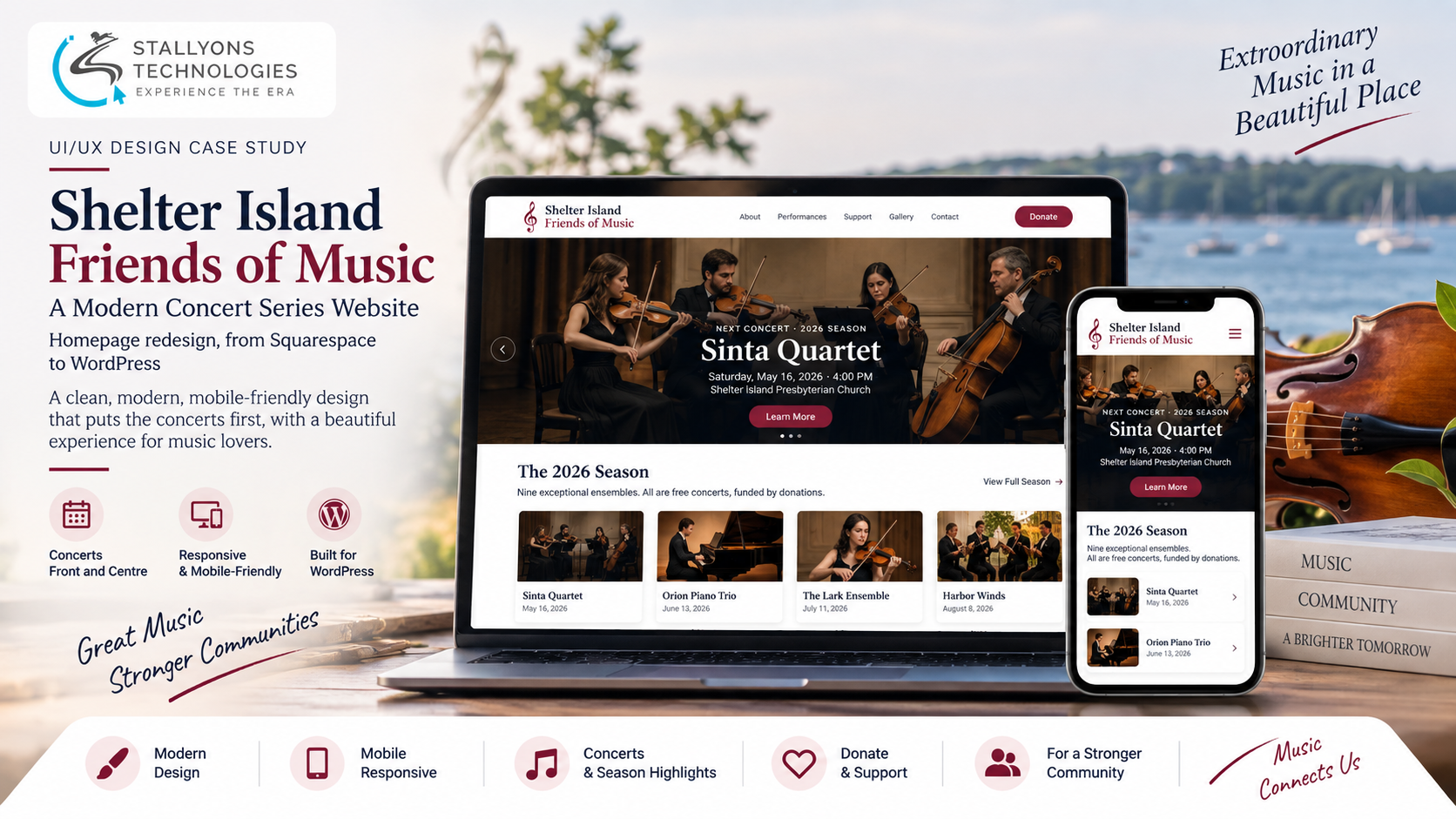
Someone hears about a free chamber-music concert on Shelter Island and pulls up the website to check who is playing and when. That one question, who is on stage next, is the reason almost everyone visits. On the old site it was hard to find, set in dated styling on a blue background with white text, under a mailing-list form and a map that repeated at the bottom of every page. The concerts, the whole point, were not front and centre.
Shelter Island Friends of Music (SIFM) is a chamber-music series on the East End of Long Island, founded in 1977, presenting world-renowned artists and rising stars in free, donation-funded concerts. The organization’s own verdict on its Squarespace site was blunt: it was not very good, and it needed modernizing without losing its content. The ask was a homepage redesign, moved to WordPress, on a lightweight theme that needs little customization, with the real content formatted in.
Put simply, the redesign keeps everything that matters, the mission, the full 2026 season of nine ensembles, the featured next concert and the invitation to donate, and reworks how it all looks and reads. This is a UI/UX case study: the design problems, how they were solved, and the result.
The Starting Point: A Dated Site That Buried the Concerts
The brief was a redesign, not a rewrite of the organization. Everything the series depends on had to survive the move; only the look, the structure and the clutter were up for change. Six problems shaped the work.
- A dated, weak design. The site looked out of date and did not reflect the quality of the concerts, so it needed a modern, credible look.
- Hard-to-read styling. A blue background with white text made pages tiring to read, and the organization specifically did not want that combination.
- The same objects on every page. A mailing-list sign-up and a map repeated at the foot of every page, adding clutter no one asked for.
- Redundant objects on each page. Beyond the footer, pages carried repeated elements that crowded the content and blurred the hierarchy.
- Not built for mobile. The site did not work well on phones and tablets, where much of the audience actually views it.
- The concerts were not front and centre. The season and the next performance, the reason people come, sat among other things instead of leading the page.
The Design Process: Build the Page Around the Concerts
The redesign is built around what people actually come for, on a clean, modern, readable layout. The homepage now leads with a hero for the next concert, for the 2026 season that is the Sinta Quartet, with its image, date and venue and a single clear action. A short welcome follows, then a tidy grid of the full nine-concert season, each card carrying its image, date and ensemble. Support and donating get a call to action of their own, since the whole series runs on donations. Turning the organization’s real content and branding into a clear, modern layout is the heart of the UI/UX design work here.
The look is modernized throughout. The blue-on-white styling gives way to a light background, dark high-contrast type and one refined accent, so pages read comfortably and feel current. The design followed a clear sequence:
- Lead with the next concert as an inviting hero, so the first thing a visitor sees is who is playing and when.
- Lay out the full 2026 season as a clean, scannable grid directly beneath it.
- Strip the repeating mailing-list form and map from every page, moving subscribing to the Contact page where it belongs.
- Remove the redundant objects crowding each page, leaving a clear hierarchy and room to breathe.
- Design mobile-first, so the same layout reflows into a single column on phones and tablets.
The footer is simplified to contact details, social links and the essentials. The design targets a lightweight, flexible theme, such as Astra or Kadence, that delivers this look with little customization, and the current content is formatted into it, ready to move off Squarespace.
Technical Architecture
The homepage was designed in Figma first, so the layout could be agreed before any theme work, then mapped onto a lightweight WordPress build. The structure rests on a handful of decisions, each answering one of the problems above.
- A concerts-first homepage. A hero for the next concert, then a welcome, then the full-season grid, so the most important content leads and nothing has to be hunted for.
- A readable type and colour system. A light background, dark high-contrast text and a single refined accent replace the tiring blue-on-white, fixing readability at the root.
- A simplified global footer. The repeating mailing-list form and map are gone; the footer carries contact details, social links and essentials, and subscribing lives on the Contact page.
- A clear content hierarchy. Redundant objects are stripped from each page, leaving generous spacing so each page says what it needs and no more.
- A mobile-first responsive layout. The same structure reflows to a single column on phones and tablets, which the old site never did well.
- A light-touch WordPress theme. The design targets a flexible theme that needs little customization, so the site is affordable to run and easy to keep updated.
Because the redesign is made to drop straight into a lightweight theme with the real content formatted in, it fits naturally into a broader web development handoff, where the design and the build are meant to meet with as little custom code as possible.
Challenges Solved
Each problem was met with a specific move. A dated look became a clean, spacious, modern layout that reflects the quality of the concerts. Tiring blue-on-white became a light background with dark, high-contrast text and one refined accent, comfortable to read on any screen. The mailing-list form and map that repeated everywhere were removed, with subscribing moved to Contact, cutting the repetition sharply. Redundant objects were stripped so each page reads clearly. A responsive, mobile-first layout replaced a site that struggled on phones. And targeting a lightweight, flexible WordPress theme let the whole thing move off Squarespace without a heavy rebuild, with the real content carried across intact.
The Result
The result is a homepage that finally leads with the concerts: an inviting hero for the next performance and a clean grid of the full 2026 season, comfortable to read, free of repeated clutter, and working properly on phones and tablets, designed to drop into a lightweight WordPress theme with minimal customization. The notes here describe the design’s intent against the brief; they are illustrative of its aims and are not measured analytics.
If you have a dated site that buries the thing people come for and needs a clean, affordable move to WordPress, you can hire UI/UX designers who redesign around your real content, or tell us about your site and we will show you what a concerts-first, readable, mobile-friendly version could look like.
Frequently Asked Questions
Why redesign the homepage around the concerts?
Because that is what visitors come for. The redesign leads with a hero for the next concert and a grid of the full 2026 season, so who is playing and when is the first thing a visitor sees, rather than something buried below repeated forms and maps.
Why replace the blue background and white text?
That combination made pages tiring to read, and the organization specifically did not want it. It was replaced with a light background, dark high-contrast type and one refined accent, so the pages read comfortably on any screen and look current.
What happened to the mailing-list form and map on every page?
They were removed from every page. Subscribing was moved to the Contact page where it belongs, and the footer was simplified to contact details, social links and essentials, which cut the repetition and cleaned up every page at once.
Can a Squarespace site be redesigned and moved to WordPress without a heavy rebuild?
Yes. Here the design targets a lightweight, flexible WordPress theme, such as Astra or Kadence, that delivers the look with little customization, and the existing content is formatted into it, so the series moves off Squarespace cleanly rather than being rebuilt from scratch.
Is the redesign mobile-friendly?
Yes. The layout is designed mobile-first, so the hero, the welcome, the season grid and the footer all reflow into a single column on phones and tablets, where much of the audience views the site, which the old design did not handle well.