


Blog
SwingSync: A Golf
App Landing-Page UI/UX Design
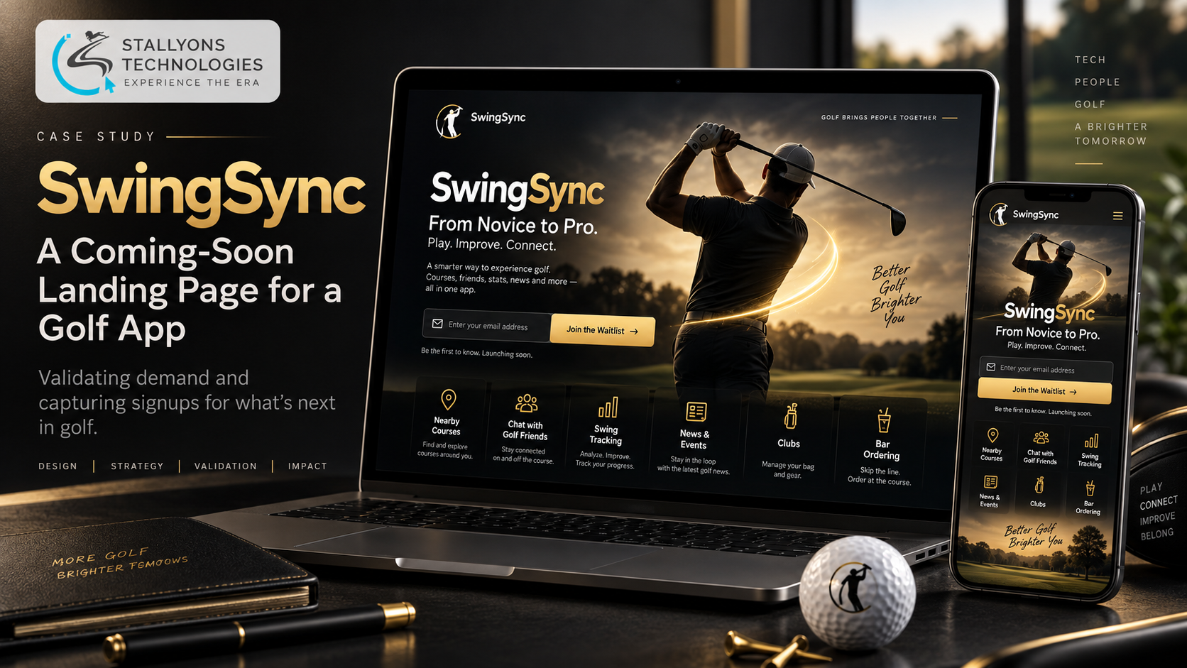
Before writing a single line of the app, the team needed one honest answer: would golfers actually want this? Not a survey, not a hunch, but real signups from real people who saw the idea and reached for their email address. That question is the entire job of the page this case study is about. It is a coming-soon landing page whose only purpose is to test demand for a golf app and capture the interest it finds.
SwingSync is an idea for a golf app for everyone from novice to professional, with plans for finding nearby courses, chatting with friends and golf colleagues, tracking swing speed, distance and direction, following golf news and club happenings, and even ordering from the bar. Building all of that is expensive, so the first step is cheaper and smarter: prove people want it. The design challenge of a validation page is focus. It has to make a broad idea instantly clear, feel premium enough that people believe in it, and lead every visitor to one action, signing up.
Put simply, the design answers that with a striking golfer-and-swoosh hero, a concise icon-led list of the proposed features, and one prominent email signup, all in a sleek black-and-gold style that suits a golf audience. This is a UI/UX case study: the design problems, how they were solved, and the result.
The Starting Point: One Page That Has to Do One Thing
A landing page built to test demand lives or dies on focus and first impression. It cannot behave like a full marketing site, and it cannot be a rough placeholder either, because a rough page tests the design as much as the idea. Six problems shaped the work.
- It has to validate demand, fast. The whole point is to measure interest, so the page needs one clear goal, signing up, and every part has to serve it.
- A broad app to convey quickly. The app spans courses, chat, swing tracking, news, clubs and ordering, so the design has to make all of that clear at a glance, not in paragraphs.
- Signups must be frictionless. Interest only counts if it is captured, so the email form has to be prominent and effortless.
- It has to feel premium. People buy into what looks credible, so the page needs a classy, sleek feel rather than a placeholder look.
- A strong first impression. A visitor decides in seconds, so the hero has to grab attention and say golf immediately.
- Risk of an overloaded page. A coming-soon page can drift into a full site, so it has to stay a single, uncluttered screen with only what is needed.
The Design Process: Point Every Section at the Signup
The design is a single page aimed at one action. The hero pairs a golfer-and-swoosh graphic with the SwingSync name, a short tagline and a signup call to action, so a visitor gets both the idea and the invitation the moment the page loads. Below it, the proposed features are shown as a concise, icon-led list, so the breadth of the app reads in seconds rather than paragraphs. Every choice here is deliberate UI/UX design in service of a measurable outcome, not decoration. The page was built to a clear order:
- Open with a golfer-and-swoosh hero, the name, a short tagline and a signup call to action, for an instant, on-theme first impression.
- Lay out the proposed features as a concise, icon-led list, so the whole idea is grasped at a glance.
- Set expectations with a coming-soon section that carries a prominent email form.
- Capture each signup, and the numbers behind it, through a simple front and back end, which is the entire purpose of the page.
The look is sleek black and gold with refined type, visuals and icons throughout, giving the page a classy, aspirational feel that fits a golf audience. Following the reference the client shared but trimming it, the design deliberately drops the pricing and questions sections, so the page stays a single focused screen, and it is built mobile-first so it captures signups on any device.
Also readApartment Management System: designing a data-heavy rent dashboard that is clear and safe to use
Technical Architecture
The page was designed as a single, top-to-bottom flow, then built as a lightweight site with just enough of a back end to store the signups it collects. The structure comes down to a few parts, each answering one of the problems above.
- A one-goal layout. Hero, feature list, coming-soon signup and a simple footer, in that order, with every section pointing at the same email form.
- A hero that sells the idea. The golfer-and-swoosh graphic with the name and tagline gives an instant, unmistakably golf first impression.
- An icon-led feature list. Courses, chat, swing tracking, news and events, clubs and bar ordering, each with an icon, so the breadth of the app reads in seconds.
- A prominent email form. Backed by a simple front and back end, it captures signups and the numbers behind them, the real point of the page.
- A black-and-gold visual system. A black background with gold accents, refined type and consistent iconography give the page a premium, aspirational feel.
- A mobile-first responsive flow. The single-column layout works on phones from the start, so signups are captured wherever a golfer sees the page.
Standing up a signup-capturing coming-soon page is exactly the kind of lean first step our MVP development team builds when the smart move is to validate demand before committing to the full build.
Challenges Solved
Every problem was met with a specific move. To test demand, the page was pointed at one goal, signing up, with everything serving it. To convey a broad app quickly, the features became a concise, icon-led list a visitor grasps in seconds. To make interest count, a prominent, simple email form backed by a front and back end captured signups and real numbers. To earn belief, a sleek black-and-gold aesthetic with refined type and imagery gave the idea a credible, aspirational look. To land a strong first impression, the golfer-and-swoosh hero said golf immediately. And to keep the page from bloating into a full site, the pricing and questions sections were dropped, leaving one clean screen.
A demand-validation landing page like this is the classic opening move for a startup building a new app, proving the idea earns real signups before a line of the product is built.
The Result
The result is a single, classy, mobile-friendly page that says what the app is in seconds, looks the part, and captures signups through a simple front and back end, so the idea can prove itself in real numbers instead of guesswork. It deliberately leaves out the pricing and questions sections of the reference site, keeping the page focused on the one thing that matters at this stage. The notes here describe the design’s intent against the brief; they are illustrative of its aims and are not measured analytics.
If you have an app idea worth testing before you build it, you can hire UI/UX designers who design coming-soon pages that actually convert curiosity into signups, or tell us about your idea and we will design a validation page that gives it a fair, premium test.
Frequently Asked Questions
What is a demand-validation landing page for?
It exists to answer one question before you invest in building: do people actually want this? Here a single coming-soon page presents the app idea and captures email signups, so real interest can be measured in numbers rather than assumed from a hunch.
How does one page convey a broad app clearly?
By showing the features as a concise, icon-led list rather than paragraphs. SwingSync spans courses, chat, swing tracking, news, clubs and bar ordering, and each appears as a short item with an icon, so a visitor grasps the breadth of the app in seconds.
Why use a black-and-gold design for a golf app?
Because a validation page has to feel premium to be believed. A black background with gold accents, refined type and consistent icons gives the page a classy, aspirational feel that suits a golf audience, so the idea looks credible and worth signing up for.
How are the signups actually captured?
Through a prominent email form backed by a simple front and back end. The form is effortless to complete and stores each signup along with the numbers behind it, so the interest the page attracts is captured rather than lost, which is the entire point of the exercise.
Why leave out pricing and an FAQ section?
To keep the page focused. The client’s reference site included pricing and questions sections, but a coming-soon page can drift into a full site, so those were deliberately dropped, leaving one uncluttered screen where every part points to signing up.