


Blog
A Single-Page Website
Designed in Framer
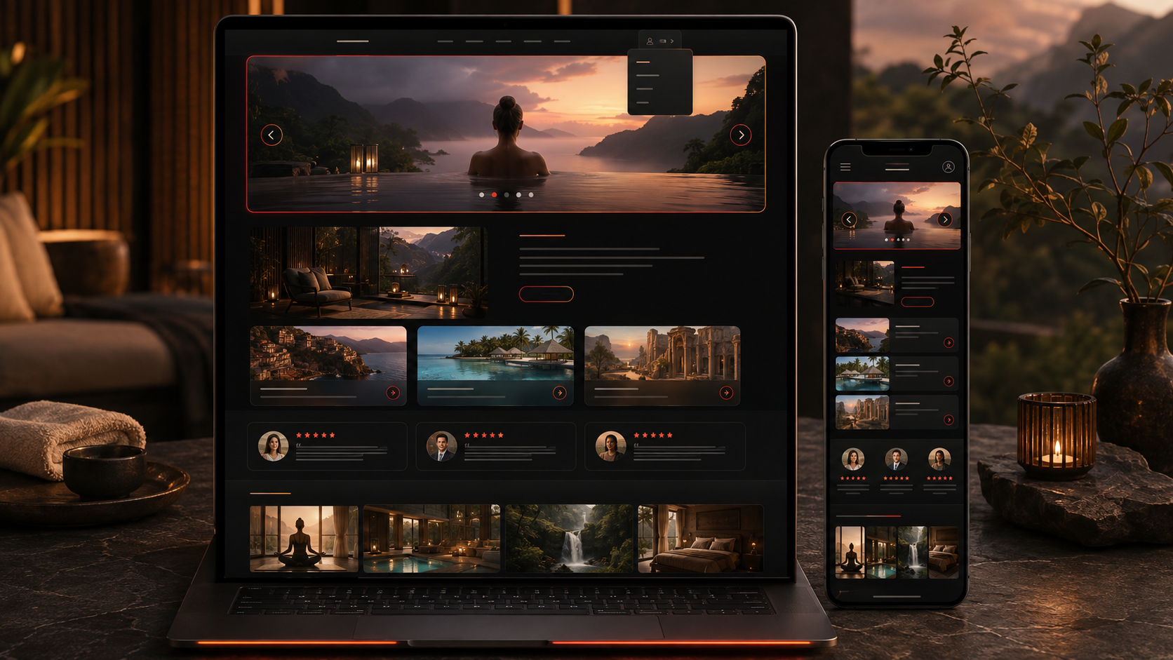
A long-running travel and wellness brand wanted its whole story on one page. Not a sprawling site with a dozen sections to click through, but a single scroll that greets a visitor, shows them where they could go, lets existing clients sign in, and carries the brand’s warmth from the first frame to the contact form at the foot.
This case study is about the responsive single-page website we built in Framer to do that, in the style of a reference site the client pointed to. It opens with a teaser carousel hero that rotates through highlights, puts navigation and a client login together in one menu, and stacks the sections such a brand needs down a single clean page. Put simply, everything lives on one scrolling page that stays warm, uncluttered, and fully responsive across mobile, tablet, and desktop.
The Starting Point: A Whole Brand on One Page
The brief was short but specific. The client admired a particular site, a travel and wellness brand offering sport and relaxation stays, and wanted the same feel: a single page, a menu with a login submenu, a teaser carousel, and full responsiveness. The challenge in a single-page design is always the same, fitting several needs onto one page without letting it feel crowded. The needs to hold together:
- Everything on one page. The menu, hero, and every content section have to sit together and flow well without feeling packed.
- A menu with a login submenu. The navigation has to let visitors move around the page and give existing clients a clear place to sign in, from the same menu.
- A teaser carousel hero. The page should open with a carousel that rotates through teasers, so the first impression moves rather than sits still.
- Fully responsive. The menu, carousel, and sections all have to adapt cleanly to mobile, tablet, and desktop.
- In the style of the reference. The structure and feel should follow the reference site, so the result is familiar and on-brand.
- Clean and welcoming. The whole page has to stay warm and uncluttered, matching the friendly character of the brand.
The Build: One Scroll, Menu to Contact
The page is one clean, scrolling design in Framer. At the top sits a navigation menu that jumps a visitor between sections, with a login submenu that gives clients an obvious place to sign in, matching the client login on the reference. The hero is a teaser carousel that rotates through highlights, trips, destinations, or features, with arrows and dots to move through it, so the page opens with movement instead of a static banner. Building it as a Framer website kept the carousel, menu, and responsive behaviour manageable without custom front-end code.
Below the hero, the sections stack in the order a brand like this needs them:
- A navigation menu with a login submenu at the very top.
- A teaser carousel hero that rotates through highlights.
- A warm introduction to the brand.
- The trips or destinations, shown as cards.
- Client reviews, for trust.
- A gallery, and the contact section at the foot.
The look follows the reference throughout, warm, friendly, and uncluttered, so the page feels familiar and on-brand while staying a clean, modern build.
Technical Architecture
The architecture of a single-page design is about flow and reflow: one page that reads well top to bottom on a large screen and collapses gracefully on a small one. The parts that carried it:
- Single-page layout. Everything renders on one scrolling page, from the menu through the carousel and sections down to the contact, so a visitor gets the whole brand in one place.
- Menu with login submenu. A top navigation lets visitors jump between sections, and a login submenu gives clients a consistent place to sign in without a separate page.
- Teaser carousel hero. A rotating carousel with arrows and dots opens the page with changing highlights rather than a fixed image.
- Content sections. Introduction, trips or destinations, client reviews, and a gallery sit in order down the page, in the brand’s warm style.
- Responsive reflow. The menu collapses, and the carousel and cards reflow to a single column on mobile, so the page holds up on every device.
A build like this fits squarely inside no-code and low-code development, where a capable platform covers the interaction and the effort goes into structure, pace, and a design that feels right for the brand.
Challenges Solved
The recurring challenge in a single-page design is density: a lot wants to live on one page, and it can quickly feel crowded. Clear, stacked sections that flow from the menu to the contact kept the whole brand on one page without it feeling packed. Putting the login in the navigation as a submenu gave clients an obvious sign-in without a separate page to build and maintain. A teaser carousel opened the page with movement and showed more than one highlight, and a fully responsive layout kept the menu, carousel, and cards working on every screen. This warm, single-scroll pattern suits travel and hospitality brands especially well, where one inviting page can carry the whole offer from a rotating hero down to the enquiry.
The Result
The result is a single, inviting page that opens with a rotating teaser carousel, lets visitors navigate and clients sign in from one menu, carries the brand’s introduction, trips, reviews, and gallery, and works cleanly on any device. It follows the reference the client admired closely enough to feel familiar, while being a modern, responsive Framer build underneath.
A single-page design succeeds or fails on how well it holds a whole brand without crowding it. If you want a page like this, warm, responsive, and complete in one scroll, you can hire full-stack developers who build responsive single-page sites in Framer, or tell us about your brand and we will lay it out from the hero to the contact.
Frequently Asked Questions
What is a single-page website design?
A site where the whole brand lives on one scrolling page rather than across separate pages. Here the menu, a teaser carousel hero, an introduction, trips, reviews, a gallery, and the contact all sit on one page, with the menu jumping a visitor between sections.
Can a Framer single-page site include a client login?
Yes. The navigation menu carries a login submenu, so existing clients have a clear, consistent place to sign in from the same menu they use to move around the page, without a separate login page.
How does the teaser carousel hero work?
The hero is a carousel that rotates through teasers, trips, destinations, or highlights, with arrows and dots to move through it, so the page opens with movement and shows more than one thing rather than a single static banner.
Is a single-page design fully responsive?
Yes. The page is built responsively in Framer, so the menu collapses, and the carousel and cards reflow to a single column on mobile, keeping the whole page readable across mobile, tablet, and desktop.
Does the design match the client’s reference site?
It follows the reference in structure and feel, a warm, welcoming, uncluttered layout with a login in the menu and a teaser carousel hero, so the result is familiar and on-brand while being a clean, modern build of its own.