


Blog
A Framer Fitness
Coaching Landing Page
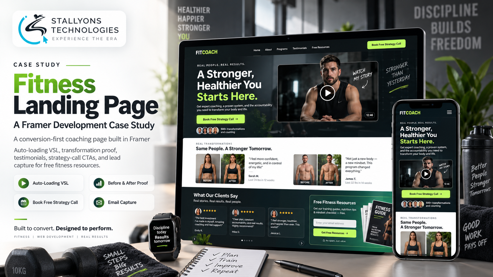
An online coach has one page to make their case. A visitor arrives and, within a few seconds, decides whether this is the person who will finally get them results or just another tab to close. That page cannot afford to warm up slowly. It has to pitch, prove, and ask for the booking before attention slips away.
This case study is about the conversion-first landing page we built in Framer for exactly that job. It opens with an auto-loading video sales letter above the fold, backs the pitch with before-and-after transformations and a scrolling wall of reviews, and threads calls to action to book a free strategy call down the whole page. Put simply, the page is designed so a visitor can convert at any point, and those who are not ready are captured onto a mailing list with free resources rather than lost.
The Starting Point: A Page That Has to Sell on Arrival
The coach admired a particular reference site and wanted the same sleek, premium feel, but the brief underneath the look was pure conversion. A fitness offer lives on proof and momentum: if the pitch does not land immediately and the proof does not convince, the visitor leaves. The page had to carry several jobs at once:
- Convert on arrival. The page exists to drive bookings, so it needs a strong pitch above the fold and clear calls to action all the way down.
- An auto-loading video pitch. A video sales letter should start as the visitor lands, so the offer reaches them before anything else does.
- Proof the coaching works. Before-and-after transformations and a carousel of reviews carry the credibility a fitness offer depends on.
- Capture the not-yet-ready. Visitors who will not book on the first visit still need capturing, through an email exchange for free resource PDFs.
- A premium, sleek look. The coaching has to read as the obvious choice, so the design needs white space, balanced type, and restrained brand colour.
- Work on every device. Most visitors arrive on a phone, so the page has to hold up across mobile, tablet, and desktop.
The Build: Pitch, Proof, Action, in One Scroll
The page opens with the pitch and never lets go of it. The hero puts the coaching above the fold with an auto-loading video sales letter and a single clear call to action, so the strongest version of the offer reaches a visitor the moment they land. A short bio and the coaching program details follow, explaining what the visitor actually gets, and then the proof arrives. We built this as a Framer website development project so the whole thing stayed fast, responsive, and easy for the coach to keep current.
From top to bottom, the page follows a deliberate order from pitch to proof to action:
- An auto-loading video sales letter in the hero, with a call to action to book a free strategy call.
- A short bio and the coaching program details, so the visitor understands the offer.
- Before-and-after client transformations, the proof a fitness offer stands on.
- A scrolling carousel of reviews and testimonials for social proof.
- Calls to action repeated at intervals, so a visitor can book from wherever they stop.
- An email capture offering free resource PDFs, so those not ready to book still join the mailing list.
The look follows the reference the client admired, generous white space, balanced typography, and subtle brand colour, so the coaching reads as premium rather than loud. Careful UI/UX design kept the page persuasive without crowding it, which matters when the whole point is a clear path to a single action.
Technical Architecture
This is a single responsive page rather than a multi-page site, and its architecture is about sequencing attention correctly and staying fast on mobile. The parts that carried the work:
- Auto-loading VSL hero. The video sales letter loads and plays in the hero above the fold, so the pitch arrives before the visitor scrolls.
- Proof blocks. Before-and-after transformations and a scrolling testimonials carousel supply the credibility, placed right after the pitch where doubt first appears.
- Repeated conversion points. Benefit-driven copy and book-a-call buttons recur down the page, so the decision is never more than a scroll away.
- Email capture. A resource-for-email exchange feeds a mailing list, turning visitors who will not book yet into leads rather than losses.
- Responsive by default. The layout reflows to a single column on mobile, where most visitors arrive, keeping the hero, proof, and calls to action intact.
A conversion page like this sits within the broader remit of no-code and low-code development, where the platform handles the plumbing and the effort goes into the pitch, the proof, and the path to action.
Challenges Solved
The hardest part was making one page do several jobs without feeling busy. Leading with an auto-loading video sales letter meant the pitch reached every visitor at once, but it had to sit inside a design clean enough to read as premium, so the proof and calls to action were spaced with white space rather than stacked into clutter. Placing calls to action at intervals solved the fact that visitors decide at different points, giving them a way to book from anywhere on the page. And the email capture answered the reality that most people will not book on a first visit, holding onto them with free resources instead of letting them go. Building it responsively kept all of this working on the phones where most visitors actually arrive.
The Result
The outcome is a premium, persuasive landing page that pitches the coaching the moment a visitor arrives, proves it with real transformations and reviews, and gives clear ways to act at every step. Visitors ready to commit can book a free strategy call from wherever they are on the page; those who are not ready leave their email for free resources and join the mailing list. It runs cleanly on mobile, tablet, and desktop, in the sleek style the coach wanted.
A conversion page is only as good as the thinking behind its layout. If you want a landing page that sells your offer the way this one does, you can hire UI/UX designers who build conversion-first pages in Framer, or tell us about your offer and we will map the pitch, the proof, and the path to the booking.
Frequently Asked Questions
What makes a fitness landing page convert?
A strong pitch above the fold, immediate proof, and a clear action. Here that meant an auto-loading video sales letter in the hero, before-and-after transformations and reviews for credibility, and book-a-call buttons repeated down the page, so a visitor can convert at any point.
Can Framer auto-load a video sales letter above the fold?
Yes. The hero was built so the video sales letter loads and plays as the visitor arrives, putting the pitch in front of them before they scroll, with a clear call to action to book a free strategy call alongside it.
How does the page capture visitors who are not ready to book?
Through an email capture that offers free resource PDFs in exchange for an address. Visitors who will not book on the first visit still join the mailing list, so they become leads to nurture rather than lost traffic.
Is the landing page responsive on mobile?
Yes. The page is built responsively in Framer and reflows to a single column on mobile, where most visitors arrive, keeping the video hero, the proof blocks, and the calls to action working across mobile, tablet, and desktop.
Why build the page in Framer rather than a custom-coded site?
Framer gave a fast, responsive, premium-looking build that the coach can keep current without a developer for every change. For a single conversion-focused page, it delivered the sleek design and the performance the offer needed without the overhead of a fully custom build.