


Blog
Fragrance Wiki: Webflow
CMS Perfume Page
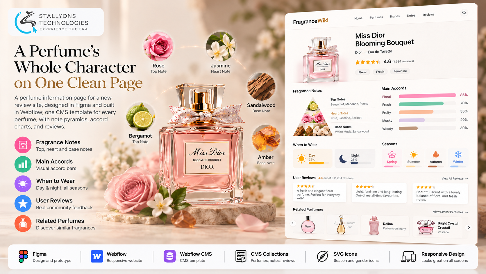
A perfume is one of the hardest things to put into words. Two scents can share a name and a bottle shape and smell nothing alike, and a shopper deciding between them wants to know the notes, the mood, the season, and what other people think, all before they spend a cent. The big fragrance databases solved this years ago by turning smell into something you can see and compare at a glance. A founding team wanted to build a review site in that spirit, and before committing to hundreds of pages they needed one page done right.
Fragrance Wiki is the perfume page template we designed and built for that site. Each perfume gets its own page with a header and overall rating, a note pyramid for top, heart, and base notes, main accords drawn as horizontal bars, a usage panel for time of day and season, user reviews, and a row of related perfumes. We designed it in Figma first, then built it in Webflow as a single CMS template so every perfume added to the collection inherits the same layout automatically.
Put simply, a visitor opens a perfume page, reads its character in seconds from charts and icons rather than paragraphs, and clicks through to the next one. The site owner enters a new perfume as a collection item, and the full design appears around it with no new build work.
The Starting Point: One Page That Had to Work for Every Perfume
A reference site lives or dies on how fast a visitor can read a product. Taking a pile of perfume data and making it calm and scannable is harder than it sounds, and the page had to hold up as the template behind a growing database. That set a clear list of requirements.
- Hold a lot of data without clutter. Notes, accords, seasons, time of day, a rating, reviews, and related perfumes all had to sit on one page and still breathe.
- Read like a reference, not a shop. The page had to feel like an information database, not a product page pushing a sale.
- Turn data into visuals. Accords and usage needed bar charts and icons, so people compare by looking instead of reading long descriptions.
- Work as a template for hundreds of pages. The design had to fit any perfume, not just the first example entered.
- Stay readable on every screen. Charts and icons had to hold their shape on phones and mid-sized tablets without overlapping.
- Match the client’s own look. A light, minimal theme built from the founders’ colour palette, so the finished site felt like theirs.
The Build: From a Figma Concept to a CMS Template Page
The page moved from a shared content pack to a live, reusable template in a set order. Designing a data-dense reference page that one non-technical owner can extend forever is exactly the kind of work a Webflow development company is suited to, because the design and the content model have to be shaped together rather than bolted on afterwards.
- The founders shared their content, images, logo, colour palette, and the reference sites they admired.
- We designed the full page in Figma, covering the header, note pyramid, accord bars, usage panel, review cards, and related perfumes.
- The first concept leaned toward an e-commerce look, so the design was reworked around information first, with the sales clutter stripped out.
- The approved design was built in Webflow as a CMS template page tied to the Perfumes Collection.
- Charts and icons were wired to CMS fields, so each perfume renders its own pyramid, its own accord bar widths, and its own season icons from the data entered.
- The page was refined on staging, including header spacing, the review cards, and a tablet-width overlap fix, then handed over with the Webflow site and an editable Figma file.
Because the whole page reads from collection fields, adding a perfume is a content task, not a design task. That is also why the Figma stage mattered so much: the UI and UX design was approved in full before a single element was built, so the reworking from shop style to reference style happened on the canvas, not in the code.
Technical Architecture
The deliverable is a responsive Webflow CMS template page, designed in Figma, with no custom backend behind it. The hard part was never styling a single page. It was fitting a large amount of structured perfume data into a minimal layout, turning that data into charts and icons, driving them all from CMS fields, and keeping everything legible at every width. Each layer has one job.
- Figma design. The full page, agreed with the client before any build, which is where the shift from shop to reference was settled.
- Webflow platform. The visual build, hosting, and SSL, with no plugins or server to maintain.
- CMS Collections. Perfumes, notes, and reviews held as data, so every page is one template fed by collection items.
- Charts from fields. Accord bar lengths and day or night suitability sized directly from numbers in the CMS.
- Icons and switches. SVG season icons and the gender symbol shown per perfume from CMS switches.
- Light theme. The founders’ palette, generous spacing, and a calm type scale that keep a dense page easy to read.
The part worth real care is the note pyramid and the accord bars. Laying top, heart, and base notes as a clear three-level pyramid, and sizing each accord bar to its strength, is what lets a visitor grasp a perfume’s character in seconds rather than wading through text. Getting that to render correctly for any set of CMS values, not just the first example, is what makes the template trustworthy.
Challenges Solved
The first concept looked like a perfume shop, with the kind of buy-now framing that suits a store but works against a reference site. Using the client’s task document and reference sites, the design was rebuilt around data first: a light theme, clear sections, and no sales elements, so the page reads as an information source. The density was the next problem, because notes, accords, usage, reviews, and related perfumes all compete for the same space. Clear sections, charts, icons, and generous spacing keep the page full but easy to scan.
Charts that behave on a wide monitor can collapse on a tablet, and at one breakpoint the daily-use charts overlapped the season icons. The usage panel was reflowed so every chart and icon keeps its own space at each width. The last challenge was the whole point of the brief: the design had to serve hundreds of perfumes, not one. The note pyramid, bottle, gender symbol, accord bars, and season icons all read from CMS fields rather than fixed images, so a new perfume is only ever a new collection item.
The Result
The finished page does the job it was built for. A visitor understands a perfume’s character almost at a glance, from the pyramid and the bars and the icons, then follows the related perfumes deeper into the site. The founders approved the design, received the Webflow site and an editable Figma file, and have a single template they can reuse for every perfume they add. Each new entry gets the full layout automatically, which is what makes the whole site practical to scale.
If you are planning a content-led site like this, you can bring in front-end developers who have turned dense data into a clean, CMS-driven template, or tell us how your content should be organised and our US-registered team will shape the design and the collection structure together. It suits any consumer and retail brand that needs one page design to carry a whole catalogue of products.
Frequently Asked Questions
What is Fragrance Wiki?
It is a perfume information page template, designed in Figma and built in Webflow. Each perfume gets its own page with a rating, a note pyramid, accord bars, a usage panel for season and time of day, user reviews, and related perfumes, all driven from the Webflow CMS.
Why build it as a CMS template instead of separate pages?
Every perfume is an item in a Webflow CMS Collection shown through one template page. That means the design is built once, and a new perfume gets the full layout, charts, and icons the moment its details are entered, so the site can grow to hundreds of pages without new build work.
How does the page turn perfume data into visuals?
Accord strengths and day or night suitability are drawn as bars sized from numbers in the CMS, and seasons and the gender symbol are shown as SVG icons from CMS switches. A visitor reads the character of a perfume by looking at the charts rather than reading long descriptions.
Can the owner add new perfumes without a developer?
Yes. Adding a perfume is a content task in the Webflow Editor, not a design change. The owner enters the notes, accords, usage, and reviews, and the template renders the page around that data in the agreed light, minimal theme.
Does the page stay readable on phones and tablets?
It does. The layout adapts from desktop down to phone, and the usage panel was reflowed so charts and season icons never overlap at mid-sized widths. The goal was that a visitor can read a perfume’s character on any device, which is how most fragrance sites are browsed.