


Blog
Mosaic: WooCommerce Tile
Catalogue Redesign
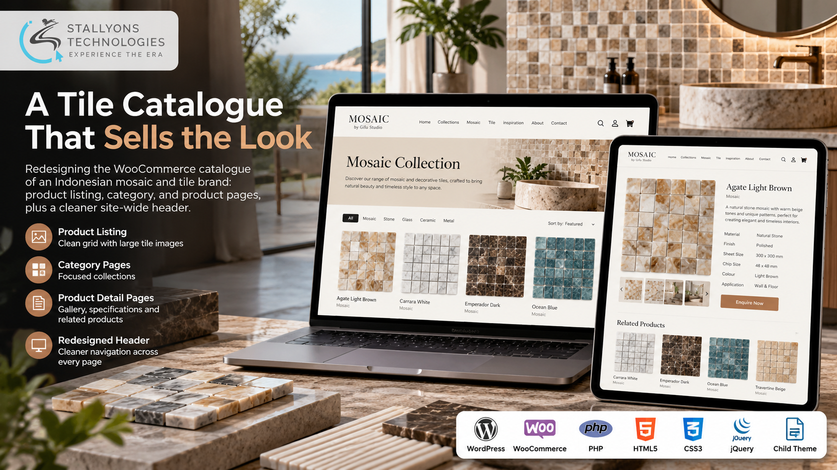
An interior designer scoping a bathroom opens a tile brand’s website and starts scrolling. Within a few seconds they have decided whether the brand is worth their time, not from the words on the page but from how the tiles look on screen. For a business that sells on looks, the catalogue is the whole pitch.
That is the problem this project set out to fix for Mosaic, an online catalogue of Indonesian mosaic and decorative tiles built by Gifu Studio on WordPress and WooCommerce. Architects, interior designers and homeowners use it to browse the collections, open a category such as Mosaic, and study individual products like the Agate Light Brown stone mosaic before they order or get in touch. The site already worked, but its catalogue pages still looked like a default WooCommerce shop, which was not good enough for a design-led brand.
Put simply, we turned a standard shop into a catalogue that reads like a design brand. We redesigned the three pages that matter most for browsing, the product listing, the category pages and the product detail pages, and gave the site a cleaner header that carries across every page. Every change was built with WooCommerce template overrides inside a child theme, on the client’s own live site, so products are still managed in WooCommerce exactly as before and the work survives future updates.
The Starting Point: A Catalogue That Looked Like Every Other Shop
Tiles are chosen with the eyes. People want to see the colour, the texture and how a mosaic reads at scale before they commit, and leading tile brands present their ranges like a gallery. Mosaic’s catalogue still showed the default layout of its theme and WooCommerce, so the work had to solve several things at once, on a budget and without taking the live site down.
- It looked like a generic shop. The catalogue used standard WooCommerce layouts, so it did not feel like a design-led tile brand.
- Products were hard to appreciate. Small images and crowded grids made it hard to see the detail and texture that actually sell a mosaic.
- Collections were not clear. Visitors needed an easy way to move from the full catalogue into a category and then into a single product.
- Product pages were weak. The detail page needed a better gallery, clearer specifications and a stronger layout to support a buying decision.
- Budget and time were limited. A full redesign was not the priority. The client wanted the catalogue pages fixed first, quickly, and without breaking anything.
The Build: From Default Grid to Design-Led Catalogue
The redesigned catalogue guides a visitor from browsing to choosing, and each page does one job well. Reshaping WooCommerce’s own listing, category and product templates so the storefront behaves like a gallery rather than a default shop is the substance of the WooCommerce theme development behind this work. The browsing path now runs in a clear order:
- A visitor lands on the product listing page and sees the whole range as a clean grid of large, evenly sized tile images, so colours and textures stand out.
- They open a collection, such as Mosaic, which now opens with a clear heading and a short introduction above a focused grid of just that collection.
- They open a product and see a large image gallery, the product name and its key details laid out clearly, instead of a cramped default layout.
- Related products sit underneath every product page, so there is always a next tile to look at without going back to the top.
A redesigned header ties the whole site together with cleaner navigation and spacing, and it appears on every page rather than just the catalogue. The layouts were built to be managed as well as admired, which is where careful UI/UX design earns its place: the client still adds and edits products in WooCommerce as before, and every new product automatically inherits the new design.
Technical Architecture
Mosaic runs on WordPress with WooCommerce managing products and categories. The hard part was never building a new system. It was changing the look of the catalogue pages inside an existing theme, on a live site, without breaking anything and without making the site harder for the client to manage.
- Product listing. A cleaner grid with larger, evenly sized tile images and consistent product cards across the whole catalogue.
- Category pages. A category heading and introduction above a focused grid of that collection, using the same layout for every category automatically.
- Product detail page. A larger image gallery, clearly laid out product information and a related-products row to keep visitors browsing.
- Site-wide header. Cleaner navigation and spacing that carries across every page of the site.
- Child theme and template overrides. All customisation lives in a child theme as WooCommerce template overrides, so the parent theme and WooCommerce can still be updated for security and features without wiping out the redesign.
- Responsive by default. Every layout adapts to phones and tablets, where many visitors first discover tiles.
Because no heavy page builder was added and nothing was rebuilt from scratch, the site stays light and the client keeps the exact workflow they already knew. New tiles go into WooCommerce, photos go into the media library, and the new layouts do the rest.
Challenges Solved
The first challenge was scope. The client’s wish list grew from two pages to the whole website, so both options were scoped and priced, and the client chose to start with the catalogue pages and the header. That put the budget where visitors actually decide and delivered a visible upgrade in days rather than weeks, with a full redesign left open for later.
The second was making the pages feel like a real design, not just tidier WooCommerce. After the first round the client wanted a stronger layout, so a review call walked through the listing, category and product pages one by one, and the feedback was turned into concrete changes until the pages were signed off. The whole redesign was done on the client’s live site using a child theme and template overrides, which kept every change separate from the core theme and plugins, the kind of careful storefront work that retail and ecommerce brands need when the website is the shop window and it cannot go dark for a rebuild.
The Result
The outcome is a catalogue that looks like the brand behind it. Visitors land on a clean grid of large tile images, move from the full range into a collection and then into a single product with a proper gallery and clear details, and find related tiles waiting at the bottom of every page. The header is consistent site-wide, the client manages products exactly as before, and the work is safe from theme updates because it all lives in a child theme.
The redesign worked because it focused the budget on the pages that sell and stayed inside WooCommerce rather than replacing it. If you want to give your own store the same treatment, you can hire WooCommerce developers who redesign catalogue and product pages with template overrides, or tell us about your store and we will map your range to a catalogue that sells the look.
Frequently Asked Questions
What did the Mosaic catalogue redesign change?
It redesigned the three pages that matter most for browsing, the product listing, the category pages and the product detail pages, and added a cleaner site-wide header. The listing became a clean grid of large tile images, categories now open with a heading and a focused grid, and product pages gained a larger gallery and clearer details with related products underneath.
Was the site rebuilt from scratch?
No. The work was built inside the client’s existing WordPress theme using WooCommerce template overrides in a child theme, on the live site. The shop system was not replaced and no heavy page builder was added, so products, categories and images are still managed in WooCommerce exactly as before.
Will the redesign survive WordPress and WooCommerce updates?
Yes. Because every customisation lives in a child theme rather than the parent theme, WordPress, WooCommerce and the parent theme can all be updated for security and new features without wiping out the new layouts.
Do new products automatically get the new layout?
Yes. The new listing, category and product templates apply to the whole catalogue, so when the client adds a product in WooCommerce and assigns it to a category, it appears in the redesigned layout with no extra work.
Which pages were redesigned?
The product listing page, the category pages, the product detail pages and the site-wide header. A full-site redesign was scoped and priced too, but the client chose to start with these pages because they are where visitors actually make a buying decision.