


Blog
Trivantage: Squarespace Code-Block
Hero
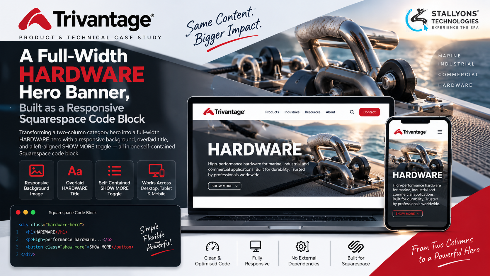
A category banner is a small thing to change and an easy thing to break. Trivantage had a two-column hero, copy and a SHOW MORE toggle on the left, a product image on the right, and wanted it turned into something bolder: a full-width hero with the product photo running edge to edge behind a large title. The catch was that the banner now lived on Squarespace, and the small piece of code that made the old toggle work was no longer there.
This project is that change, delivered as a single self-contained Squarespace code block. The two-column banner becomes a full-width HARDWARE hero: the supplied hardware image sits as a responsive background, the large white HARDWARE title is overlaid on top of it, and the copy and a left-aligned SHOW MORE toggle sit below. It is an adjustment to the existing block, not a rebuild.
Put simply, we restructured the block in place rather than starting over, set the 1570 by 404 pixel image as a background that scales cleanly from a 1570-pixel desktop down to tablet and phone with no distortion or awkward cropping, kept the white title legible over a busy photo, and re-wired the SHOW MORE toggle with a small script inside the block so it keeps working without the original platform’s JavaScript. Everything lives in one block that drops straight into a Squarespace code area.
The Starting Point: Change the Layout, Keep What Works
A category hero needs to change layout and platform without losing what already works. The change was small in scope but exacting in detail, and it came with a clear set of requirements:
- Go from two columns to one full-width hero. The split of copy on the left and image on the right had to become a background image with an overlaid title, while staying a single self-contained block.
- Scale the background cleanly. A 1570 by 404 pixel image had to fill the hero across desktop, tablet, and phone with no distortion and no awkward cropping.
- Keep the title legible. A large white HARDWARE title overlaid on a busy hardware photo had to stay readable at every size.
- Keep the SHOW MORE toggle working. The reveal behaviour had to survive the move, even though Squarespace does not provide the original platform’s global JavaScript.
- Prioritise desktop without breaking mobile. The design is tuned for the 1570-pixel desktop first, yet still has to hold together on smaller screens.
- Adjust, do not rewrite. The existing markup, styles, and structure had to be reshaped in place rather than thrown away.
The Build: One Block, Restructured in Place
The whole piece is one code block, and the work was to reshape it rather than replace it. The two-column layout is restructured into a single full-width hero with the image behind the content, done by adjusting the existing markup and CSS. Doing this cleanly inside a code area, so it pastes in and simply works, is the substance of the custom Squarespace development behind the banner. The change ran in a set order:
- The two-column split is restructured into a single full-width hero with the image behind the content.
- The hardware image is set as a responsive CSS background that resizes cleanly at every breakpoint.
- The large white HARDWARE title is overlaid on the image with the specified typography and kept legible.
- The copy and the SHOW MORE toggle are placed below the title, left-aligned with the text.
- The toggle is re-wired with a small self-contained script, so the smooth reveal and the fade clearing on expand survive without external code.
- The 1570-pixel desktop layout is tuned first, then the tablet and phone breakpoints are checked so nothing breaks on smaller screens.
It was delivered with a short read-me of what changed and where, one desktop screenshot of the expanded state, and confirmation that the SHOW MORE toggle works. Because everything sits in one block, it is easy to paste, verify, and maintain.
Technical Architecture
There is no backend here. The whole thing is one self-contained code block, HTML with embedded CSS and a small script, which is exactly why it is portable and low-risk. The parts that carried it:
- Squarespace code block. A single self-contained HTML, CSS, and JavaScript block with no external dependencies, so it drops straight into a Squarespace code area.
- Responsive background image. The hardware image at 1570 by 404 pixels is set as a CSS background that fills the hero and resizes cleanly, with no distortion and no awkward cropping.
- Overlaid title. The large white HARDWARE title carries the specified typography and stays legible over the photo at every size.
- Left-aligned content. The copy and the SHOW MORE toggle sit below the title, left-aligned with the text.
- Self-contained toggle script. A small piece of vanilla JavaScript restores the SHOW MORE reveal without the old platform’s global code.
- Desktop-first breakpoints. The 1570-pixel desktop is the priority, then the tablet and phone breakpoints are tuned around it.
Hand-built components like this belong to front-end web development as much as to any platform, because the care is in the markup, the CSS, and the script rather than in a page builder. The part worth engineering carefully was making a fixed-size image scale cleanly at every breakpoint and re-wiring the toggle to run on its own, all without rebuilding the block.
Challenges Solved
The harder problems were the ones hiding inside a small change. Turning two columns into one hero without a rebuild meant restructuring the existing block in place, so the right-hand image became a full-width background and the content moved below the overlaid title while everything that already worked kept working. Scaling a fixed-size image cleanly meant setting the 1570 by 404 pixel photo as a responsive background that fills the hero without distortion or cropping. Keeping the white title legible over a busy photo took careful placement and styling. And re-wiring SHOW MORE for Squarespace, where the original global JavaScript is not present, meant a small self-contained script that restores the exact behaviour inside the block.
The banner belongs to a product catalogue, the kind distribution and supply businesses run when a category page has to look right and behave right on every screen.
The Result
The outcome is a full-width HARDWARE hero that looks right and toggles right at desktop, tablet, and phone, with the hardware image as a clean responsive background, the white title legible on top, and the SHOW MORE reveal working on its own inside Squarespace. It is one self-contained block that pastes straight in, adjusted rather than rebuilt, and it was delivered with a read-me of what changed and a desktop screenshot of the expanded state.
The build works because it changed only what the new layout needed and kept everything that already worked. If you have a Squarespace component that needs the same careful hand, you can hire front-end developers who work inside code blocks like this, or tell us what needs changing and we will adjust it in place.
Frequently Asked Questions
What was changed for Trivantage?
A two-column category banner was turned into a full-width HARDWARE hero, delivered as a single self-contained Squarespace code block. The product image became a responsive background, a large white HARDWARE title was overlaid on top, the copy and SHOW MORE toggle moved below it left-aligned, and the toggle was re-wired to run on its own. It was an adjustment to the existing block, not a rebuild.
How does the SHOW MORE toggle work on Squarespace?
The original toggle relied on the previous platform’s global JavaScript, which Squarespace does not provide. So it was re-wired with a small self-contained script inside the block, which restores the exact behaviour: a left-aligned, smooth reveal with the fade clearing on expand, and no dependency on any external code.
Does the background image stay sharp on mobile?
Yes. The 1570 by 404 pixel image is set as a responsive CSS background that resizes cleanly at every breakpoint, so it fills the hero without distortion or awkward cropping. The desktop layout at 1570 pixels is the priority, with the tablet and phone breakpoints tuned so nothing breaks on smaller screens.
Was the banner rebuilt from scratch?
No. The existing block’s markup and styles were restructured in place, which kept the change fast and low-risk and preserved everything that already worked. That is why it is described as an adjustment rather than a rebuild.
Can this drop into any Squarespace site?
It is built as a single self-contained block, with the HTML, CSS, and toggle script all in one place and no external dependencies, so it pastes straight into a Squarespace code block. A short read-me documents what changed and where, which makes it easy to verify and maintain.