


Blog
Apartment Management System:
A Dashboard UI/UX Design
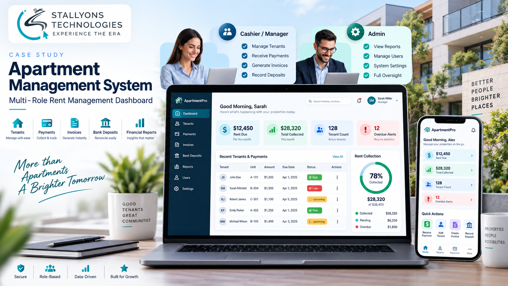
It is the first of the month and the cashier logs in. Before scrolling anything, they need three answers: how much rent is due, how much has come in, and who is late. On most rent tools those numbers are buried in a table you have to read row by row. Here they sit across the top of the screen as the first thing you see, because when an interface handles money, the important things cannot be one click away and the risky things cannot be easy to get wrong.
That is the design problem this project set out to solve. The Apartment Management System is a tool for running the rent side of a lot-and-trailer property: tracking tenants, collecting payments, applying late fees, recording bank deposits, generating invoices and reports, and sending reminders. It serves two roles, a cashier or manager who handles day-to-day tenants and payments, and an admin who also manages users, financial reports, and settings.
Put simply, the design takes a data-heavy financial tool and turns it into a calm dashboard that leads with the numbers that matter, makes payment status readable at a glance, keeps every form short and guided, and shows each role only what it needs. This is a UI/UX case study: the design problems, how they were solved, and the result.
The Starting Point: A Money Tool That Could Easily Overwhelm
A multi-role rent-management tool is easy to make overwhelming and easy to make error-prone. Tenants, payments, deposits and reports pile up fast, and every screen touches money. The brief was to design something a cashier or an admin could open on the busiest day of the month and use with confidence. In practice the hard parts were six.
- A data-heavy tool that could overwhelm. Tenants, payments, deposits and reports add up quickly, so the interface has to surface what matters and hold the rest back rather than show everything at once.
- Payment status hard to read. Whether a tenant is paid, late, or due soon is the single most important thing on the screen, so it has to be legible instantly, not decoded from a table.
- Slow, error-prone data entry. Adding a tenant with an ID photo, receiving a payment, creating an invoice and recording a deposit are frequent tasks, so the forms have to be quick and hard to get wrong.
- Two roles with different needs. A cashier and an admin do overlapping but different work, so each should get a focused screen rather than one crowded interface.
- Money actions must be safe. Payments, automatic late fees and bank deposits move real money, so those steps have to be explicit and clearly confirmed.
- Reports must be painless. The admin needs financial records without fuss, so producing a report should be a few clear choices, not a chore.
The Design Process: Put the Money First, Keep Everything Else Calm
The design leads with the money and keeps the rest quiet. The dashboard opens with KPI cards for rent due, total collected, tenant count and overdue alerts, so a manager or admin knows exactly where the property stands the moment they log in. Tenant and payment lists each carry a plain paid, late, or upcoming badge and can be filtered by status, so late payers and upcoming dues stand out without reading every row. A left sidebar handles role-based navigation: the cashier sees dashboard, tenants and payments; the admin also sees reports, user management and settings. This kind of clarity-first UI/UX design is what separates a tool people trust from one they second-guess.
Data entry is kept short and guided, and the money actions are handled as deliberate, confirmed steps rather than casual edits. Receiving a payment is a good example of a flow designed to run in a fixed order:
- Open the tenant and start a payment, with the amount due and any balance shown up front.
- If the payment is late, the system applies the automatic late fee and shows the adjusted total before anything is saved.
- Confirm the payment, so the person sees the exact result they are committing to.
- The tenant’s status and the collected total update, and a receipt or invoice can be generated from the same place.
Recording a bank deposit follows the same spirit: it updates a running balance and confirms the new figure, so the risky steps are always explicit. The admin generates financial reports by type and date range and downloads or prints them, and settings such as the late-fee amount, reminders and security all live in one place. The whole interface uses a single calm accent, with semantic colour reserved strictly for status, and reflows cleanly from desktop to mobile.
Also readShelter Island Friends of Music: modernizing a concert-series website and moving it to WordPress
Technical Architecture
The design was built as a component-driven system, so the same pieces behave the same way everywhere and the layout is easy to hand to developers. The structure centres on a few building blocks, each mapped to one of the problems above.
- A sidebar-and-content shell. Role-based navigation on the left, content on the right, with the cashier and admin seeing different menus from the same shell rather than two separate apps.
- KPI cards up top. Rent due, total collected, tenant count and overdue alerts are the first row on every visit, so the state of the property is read in seconds.
- Status badges and filters. A reusable paid, late, or upcoming badge with semantic colour, plus status filters on the lists, so payment state is legible without scanning.
- Guided forms as components. Adding a tenant with an ID photo and a trailer-or-lot flag, receiving a payment, invoicing and recording a deposit are each a short, focused form built from shared inputs.
- Confirmed money actions. Payment, automatic late fee and deposit flows each carry an explicit confirmation state, so money never moves on a stray click.
- A responsive layout. The same structure reflows into a single column for phones and tablets, so the tool is usable on site, not just at a desk.
Designed as a role-based, data-heavy product, this is the same discipline our SaaS product design work applies to any dashboard where the numbers, not the chrome, are the point.
Challenges Solved
The hardest problems all came from one tension: the tool holds a lot of information and handles money, yet has to feel simple. Leading every screen with KPI cards tamed the data, so the key numbers are grasped in seconds instead of dug out of tables. Status badges with reserved semantic colour, plus filters, made paid, late and upcoming legible at a glance. Short, guided forms cut the friction and the mistakes out of frequent data entry. Role-based navigation gave the cashier and the admin each a focused screen instead of one crowded one. Explicit, confirmed flows, including the automatic late fee, made the money work safe. And report generation by type and date range turned oversight into a few clicks.
Because it manages tenants, rent, late fees and deposits for a physical property, this dashboard maps directly onto the day-to-day of real estate and property management operators who need the money side to be clear before it is clever.
The Result
The outcome is a dashboard that a cashier or an admin can open on the first of the month and read at a glance. Rent due, collected and overdue lead the screen. Tenant and payment status is a badge, not a puzzle. Adding a tenant, taking a payment, invoicing and recording a deposit are quick, guided and confirmed, with the automatic late fee handled in the open. Each role sees only its own tools, and the whole thing works on a phone as well as a desk. The notes here describe the design’s intent against the brief; they are illustrative of its aims and are not measured analytics.
If you are designing a data-heavy tool where money and clarity have to coexist, you can hire UI/UX designers who have shaped exactly this kind of role-based financial dashboard, or tell us about your tool and we will map your screens, roles and money actions into a design people can trust.
Frequently Asked Questions
What makes a data-heavy financial dashboard easy to use?
Leading with the numbers that matter. Here the dashboard opens with KPI cards for rent due, total collected, tenant count and overdue alerts, keeps detailed records in filterable lists, and reserves semantic colour for status only, so the important information is read in seconds and the rest stays out of the way.
How does the design make payment status readable at a glance?
Every tenant and payment carries a plain paid, late, or upcoming badge in a reserved semantic colour, and the lists can be filtered by that status. Late payers and upcoming dues stand out immediately, so no one has to read every row to see where things stand.
How does a role-based dashboard work for a cashier and an admin?
Both roles share one shell, but the left-hand navigation changes by role. The cashier or manager sees dashboard, tenants and payments; the admin additionally sees financial reports, user management and settings. Each person gets a focused screen instead of one crowded interface holding everyone’s tools.
How does the design keep money actions safe?
Payments, automatic late fees and bank deposits are handled as explicit, confirmed steps. Receiving a late payment applies the late fee and shows the adjusted total before saving, and a deposit updates and confirms the running balance, so money never moves on a stray click.
Is the dashboard usable on mobile?
Yes. The sidebar-and-content layout reflows into a single column on phones and tablets, keeping the KPI cards, status badges and guided forms intact, so a manager can check the numbers or take a payment on site rather than only at a desk.